These days it seems dashboards are all the rage. From the Siebel implementations to the legacy systems, to financial, it seems that everyone wants to create the ideal corporate dashboard that will service everyone's goals.
I have a different point of view. You probably would not expect less from me surely :)
The machine operator in the manufacturing assembly line has probably no use for the same KPI's as the financial controller. The Sales executive has a different set of information needs than the Global Manager / VP of Sales. So the answer really lies at the
heart of the promise of BI:
to provide accurate, actionable information that is relevant to the consumer of the information.
What really needs to happen before just constructing a dashboard, is that the information needs have to be assessed then a relevant set of indicators / measures need to be identified. Once this is done, then optimal visual design can be started.
KPI'sOne of my pet peeves, is seeing a requirements document that identifies 100+ KPI's. Let's quickly look at what KPI means. The first letter 'K' means 'Key'. There is no way that 100+ "things" can all be "key" with the same weighting.
Think of a visit to the doctor for a checkup, first your heart is checked, your breathing, your weight, blood pressure and lungs. These are the KPI's. If a doctor picks up that one of these is way out of line from where it ought to be, immediate action can be taken (pills, injection, surgery, rest, etc.). KPI's in business need to be the same, however a business is a very complex organization with many different facets, each managed by a specialist in the relative field.
For finance people, important things to keep track of is current cash burn rate, mean time for collections, percentage of revenue that is late / past due, forecast cashflow, current ratios for assets, debtors, creditors, percentage overrun on budgets / forecasts for month-to-date, year-to-date, etc. This is probably not a full list of all the indicators needed, but you can now
see that these indicators are of very little value to the quality control manager on the plant floor who needs to track things like labour productivity rates, reject rates, inventory control, number of inspections performed and the outliers / exceptions on these figures.
Thus there is a clear need for dashboards per role. There should be a Finance manager dashboard, a Creditors clerk dashboard, a CEO Dashboard, a COO dashboard, a CFO dashboard, a Assembly line manager dashboard, and so the list goes on.
Dashboard DesignNow let's look at the design of dashboards and how easy it is for these to get cluttered. In my opinion, a dashboard should be no more than about 6 - 8 different indicators. Think about your car, you have a speedometer, a tachometer, fuel gauge, temperature gauge, trip meter. These are your key indicators, everything else becomes superfluous. Besides that, do you really get any actionable information from knowing the exact temperature of the oil in the system or the amount of charge generated by the alternator? The key things you can take action on is generally the speed you're traveling at, the amount of fuel in the tank and if you have a GPS navigation system knowing where you're going.
Dashboards should follow a similar design strongly embracing the KISS principle, but I have seen to often how runaway design turns some dashboards from a normal car dashboard into
something you would expect to see in a 747 cockpit, which just becomes intimidating with information overload.
Pictures paint 1,000 words. People have been created as visual beings, so the more one can express on pictures the better.
Pet Peeve: 3D ChartsA caution here is on 3D charts, they create so much more confusion and noise than having things expressed in 2 D. Take a look at some of these 3D charts, some of which look pretty slick and cool. However if the purpose of information is to inform, then these visual representations have just failed the basic premise of what they're trying to do.
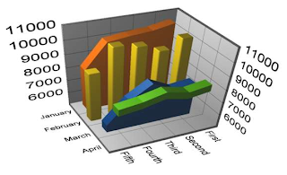
Let's discuss this chart and why it has been chosen as a target of criticism. As nice as it is supposed to look, what information are you able to glean from it?
Fault 1: There are 2 Y Axes and it seems they are calibrated the same. Are they? who knows? Take a wild flying guess, they look the same.
Fault 2: What is the green line chart supposed to Show, does it cover the Fifth X Axis value?
Fault 3: Multiple types of charts: Bar charts, area charts and a line chart? Why does each month have a different type of chart when months belong to the same dimension and grain?
Fault 4: What is the purpose of the 3rd dimension?

.
Let's look at this slightly better one to "tear it apart"
Fault 1: the third dimension can hide some of the detail, for instance, the 2nd series of Thursday seems almost hidden from view, so that we cannot get a really good picture.
A much better option here would be to have side by side vertical bar charts for each series, so for each day, we would have 2 bars, a red one (series 1) and a pink one (series2).

What is wrong with this one?
Well, once again, the 3rd dimension causes the first few series to hide the detail of the series that are shown behind.
How can I know for sure the value of Monday at 18:00? I can only assume (ass-u-me, making an ass of you and me) that it follows the trend, but the precision is lost in guesswork. This chart has failed to accurately inform me of the full picture, so in my opinion, is near-useless unless I am happy with making a decision on a partial picture where I get to guess the rest!
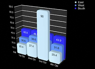
So now what could I possibly find objectionable about this beautiful flash chart?
Once again, I can only guess the values for 3rd Quarter for West & South ?
What if the first series (East, the lightest colour) had higher values than the other 2 series? I would not even get a glimpse at the other values.
Bottom line (finally!) folks (my opinion): Avoid 3D not just in dashboards, but in charts as a whole.
3d seems forgivable when you have a very specific thing that you are trying to show and have good justification for the 3rd dimension.
 This simple diagram shows the processes that should be involved for monitoring exceptions, and KPI's for that matter too.


