07 September 2009

Dimensions, Conformed Dimensions, Collapsed Dimensions, Snowflaking

That sounds like quite a mouthful to say all in 1 sentence. Let's break this thing down into bite-sized chunks.

If a picture paints 1,000 words, I am going to endeavour to save a few thousand words.

I am going to assume that you are somewhat familiar with the difference between relational and dimensional models. In case you're not, let me briefly summarize:
Relational models usually deal with OLTP applications and are normalized, thus avoiding redundancy and allowing for reuse, good application data model design, conformity and fast retrieval of small amounts of data, which is typical of online transactional processing applications (OLTP), like CRM, or airline reservations, etc.

In the world of Data Warehousing or its predecessor (DSS: Decision Support Systems), we're typically dealing with less granularity and aggregated data. Having a dimensional model allows us to summarize a fact (sale, order, web visits) by a dimension (month, demographic / other attribute (example: number of orders by sales method (online, direct-mail, store, direct-market ([pyramid], etc.)


Here we see a flattened structure (ORDERS) which is the FACT table. The fact is that an order was taken. The dimensions (attributes) of the order are:
  • By whom?
  • When?
  • Where?
  • For whom?
  • For how much?
  • Delivery details

In a previous post, we discussed conformed dimensions, and one of the typical conformed dimensions is the time dimension, since every entity that uses time will be using the same instance of time. Thus when an order was taken on a given day (say 20th June), it is the same 20th June that we had a staff turnover event, that our IVR received a phone call, that we received some goods into inventory, that we got a return from a previous order, that we had some customer service activity. Since all these facts use date and the date referred to will be the same, we can reasonable safely assume that the Date Dimension will be conformed to the same values between all these facets of the business. Great, now that conformed dimensions is no longer a mystery, let's move on.

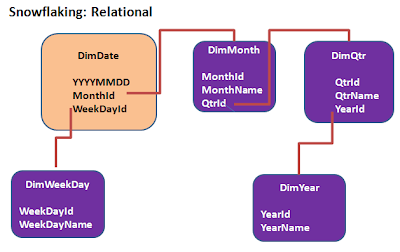
However, when we look at a date (I am going to ignore the time of day for this example, but that can come into it too, just think about it, like "before lunch / tea", etc.), as we aggregate and rollup, we can see that the Date Dimension is actually part of a hierarchy of attributes. For instance, any given day falls within a given month, which falls within a given quarter. Quarters are differentiated from each other by the years they refer to (example: Q1 of 2008 is different to Q1 of 2009, etc.).

When we start to relate each and every part of the dimensional attributes to new dimensions, we refer to this as a snowflake schema, and it starts to resemble a relational model again. Be careful!


While there is inherently nothing wrong with this, it does beg the question: why?
The only advantage clearly visible is that the redundancy is removed, thus to describe the quarter, there will only be 1 record with a value for quarter. However, keep in mind that in a data warehouse, we are not interested in normalization or eliminating data redundancies, which means it is OK to break the first law of normalization (1NF [1st Normal Form] states no repeating groups).

The design above represents some performance challenges which will bite you in the rear when dealing with large volumes of data, even medium-sized data volumes. You are creating more joins, more chance of something going wrong, more work for the optimizer, more paths and statistics to consider, back to all the reasons why large-scale aggregation in an OLTP environment is a bad idea. So what to do? What to do?

I'm glad you asked that question, I may just have an answer. By collapsing the upper levels of the dimensional hierarchy into the lowest level of granularity (YYYYMMDD), we will repeat the values for quarter name, year, etc., however we have 1 single table to go to thus dramatically improving performance.


This structure yields massive performance gains, especially true if you are employing a vertical / column-based DW architecture.


If there are 90 days in a quarter and 365 days in a year, instead of the key to the year or quarter dimension, you now have the values repeating inside a single table, at the lowest level of granularity.

I have seen relational modelers struggle with this concept and understandably so, especially if they have had decades of ingrained normalization as part of database design.

With a data warehouse, the generally accepted rules of OLTP don't really apply ( at least they SHOULD not, if designed properly) , so hopefully this article has illustrated in a down-to-earth manner what is a collapsed dimension, whether conformed or not.

Just for recap, it is when the upper node values of the hierarchy are represented (redundantly so) at the lowest level of granularity. This also allows for very easy drill-down and querying.

Have an awesome day.

27 August 2009

The Flaw of Averages

I have heard it said before to trust the law of averages. In the present day and age, everyone wants to predict the future and to be able to prepare for it. In doing so, we often try to use averaging only to be disappointed / shocked / outraged at the results when we compare reality with our predictions.

If we look at a popular index, being CPI (Consumer Price Index) which measures how much more expensive things are from year to year. In Australia, we are used to an annual CPI of 3% - 3.5%, however anyone that has been inside a grocery store in the last 6 months knows that 3.5% would be a wonderful dream come true. We often see grocery prices rise by anything from 10% - 25% in a given year, not counting seasonal items for which prices spike and dip according to the supply-demand equation. I am most certain this is not unique to Australia, as having lived in the USA and South Africa for some time, I recall the same shocked realization, even though the periodic statistics that were released assured me of a CPI well below my own rudimentary findings.


Sam Savage recently published a book titled "The Flaw of Averages" which takes us into a full-blown study of the dangers of decisions based on averages. You can also find more information here.

There is the story of the statistician who drowned while crossing a river that was on average 0.6 m (2 feet) deep. As you can image, the deepest part of the river may well have been several times deeper than the man was tall. Or perhaps the hapless soul lost his footing and remained horizontal (making him maybe 0.4 m tall) for too long and not able to breathe.

In the same way, in business we know that if we experienced a 5% overall growth or contraction, it is never assumed that all pro
ducts / services grew / shrank by the same as the average. So be careful when business decisions are made based on average figures.

Let's take an example KPI: assuming we had 100 products to sell and we sold 100,000 of each product for the year (10 million items sold).

If our QA policy allows for 2% returns due to quality problems (clearly not Six Sigma compliant), this means that 95,000 items returned in the year (0.95 % returns) means we are doing OK and well within the allowed range. Therefore as long as returns stay under 2% (gosh we even managed to get it under half of that), then the Production manager should have no reason to jump up and down ranting and raving like a lunatic!

However, if we dig further, and find that of the 95,000 returns, as much as 94,000 are on one single product and it just happens to be a very profitable line (excluding
returns), then we can start to understand the reason the Production manager is constantly screaming and about to have a cardiac arrest, as this represents a 94% deficiency rate.

Here is another example with a report (please pardon haziness due to resizing of image to fit the page) to show the outliers both good and bad.


Here we can clearly see that not all sales reps are pulling their weight equally in terms of the dollar value of products sold. However, this also shows that a single aggregate measure in and of itself should not lead to knee-jerk reactions. While this report indicates turnover, the individual sales reps profitability may look completely different, and if we combine this with returns / rejects, and possibly customer service scores, the skewing might not look nearly as bad as initially perceived.

Thus we conclude that averages by themselves are a dangerous measure and to get a better overall picture, we need multiple measures. KPI's should not be restricted to a single measure, but an indicator could be a complex algorithm that include multiple measures to derive a single indicator value that immediately spells out to its audience whether the picture of events is good, bad or neutral.

Have an awesome week!


03 August 2009

The Right sequence of questions for business

We were taught in school that there are 6 main question words: how, what, who, why, where & when. Of course as you get some business experience under your belt you realize there are many ways to ask questions, but in essence it does come back to these 6 basics.

As a former DBA (Database Administrator) in the late 90's, I used to focus a lot on providing answers to the "how" and the "what" questions. On one such occasion, working in Dallas, TX, I was asked to create a replicated 1 TB Oracle database (I exaggerate, at the time it was just shy of 800 GB) with nightly refreshes on a standby instance, I found out the best way to do this (and it was not using Oracle 8 replication). To cut a long story short, in a little under a week (after all the hardware was in place), I had a system going that used Quest Shareplex to replicate the transactions from our live production database to the standby database, using log-based replication. Neat! Time to don the cape and assume the role of hero-of-the-moment.

After this was set up, I one day asked the CIO what purposes this standby instance served, because I saw some lengthy queries running on it, almost daily. I was then told that this was for operational & financial reports that took about 3 - 4 hours to run (3 million customers, 1.5 billion transactions), which could not be run in the OLTP instance as it would drastically affect performance for 3,000 or so online users. So my next questions (as a curious DBA) of course were:
  • "Which reports?"
  • "What type of reports?"
  • "Run how often?"
  • "Via what interface?"
  • "Delivering information how?"
  • "How much data scanned / delivered?"

Upon some deeper and further investigation by the ever-more curious tech-head I was (using tkprof , PMON and sql tracing), I found a 16 way join on a query (not so bad if you consider some of the queries from hell generated by Siebel) that involved 4 of our largest tables, 2 of these joined by correlated subqueries using suboptimmal index range scans, simply to check for records that did or did not exist in a particular entity (the details are now fuzzy). Day old data was perfectly acceptable
.

When I reverse-constructed the logic (from undocumented code and 8 level deep nested DECODE expressions, you HAVE to love that!) and verified it with the developers, I found that if I ran a process every day at 5 p.m. using cron to simultaneously create 3 temporary datasets from the master tables, then indexed these datasets properly, this piece (creating the temporary data sets) would take about 90 seconds to run, using about 10 MB of storage. If we rewrote the main exception reports to run against these, the longest report would run in about 20 seconds, while most of them completed in under 10 seconds. Quite a lot better than the 3+ (and growing) hours it was currently using. At this rate, considering these queries ran once per day, the need for the standby instance vanished.

Now the next question was another "how" question, as in "how do I tell my boss, the CIO, that the 100 brand new 18 GB EMC Symmetrix (then: state of the art, today: state of the ark) disks he has bought to facilitate this reporting need, could have been solved with about 2 weeks' worth of investigation and rewriting the queries so that they ran smart and in the same instance in a separate schema that self-refreshed?". I think I have subconsciously blotted that day from memory but I do remember a lot of tension and things being thrown around to the beat of expletives. As of that day, I was included on the design phase of every major impact solution that was to be created, as a solutions architect.

The right sequence of questions (by whomever) in this case would have been to ask "Why is this database needed? What is it going to be used for? By whom? How often?". By asking those questions, we possibly could have designed a different solution and saved the company a minimum 7 figures in cost. This simple education was probably more expensive than an entire Phd in astro-physics would have cost at the best universities in the world.

As the saying goes "As long as we learn from our mistakes ...". Let me add "... and someone else is picking up the tab for it ..."

Often in the world of BI, we jump right into the virtues of a given toolset without really understanding why we are doing this and "because the boss wants it this particular way" is a pathetic justification. One reason for this is pre-negotiated contracts for toolsets before the problem is clearly stated, tsk, tsk!. We then often land up with a solution that is short-sighted and that the end users of the system will simply "have to endure since it is now built". Hello shelfware!

In order to streamline the costs and harness the collective wisdom of the people on any given project, having a top-down approach that allows bidirectional open questioning will not only result in a better solution being built, but also in the sharing of knowledge and the reduction of cost. I realize that this is often easier said than done.

I have seen many times how technical people have the vanilla solution of "let's build a cube" to answer any of the challenging questions from business. They then "throw it across the fence, to see how they like it" to startled amazement / disappointment when the users complain that while this is nice, it does not actually solve their problems. Often the additional computing / resource overhead of populating the cube/s has now made the problem worse.

It is relatively important to consider that the first word in BI is "Business". Therefore, it is imperative that the questions that are asked right at the outset have nothing to do with technology and everything to do with the business. This can only happen when there is a good understanding of the drivers behind the business and what is important. The questions facilitating this could be:
  • What?
  • Why?
  • To whom?
  • How Often?
  • Via what mechanism?
  • What will be done with the information? (This is often the one that will decide the detailed scope and next steps)
  • What latency?
These one cannot outsource to IT (even more so if the IT is offshore in a different social and economic culture to the users and customers of the organization), the business MUST be intimately involved if a successful solution is sought. On another note, having an intuitive toolset that does not require a 2 - 4 day class to learn to run (especially for end users) is imperative. For end users, knowing how a solution fits into the business is (or should be) a higher priority than flashy bells, whistles and gadgets.

Getting off my soapbox now ....

Have an intelligent week!

28 July 2009

Blackberry causes ADD at work

Today's blog is less about pure business intelligence, but has everything to do with serving customers and colleagues.

We have probably all been villain and victim of the Blackberry syndrome, where you are in a meeting / presentation and the Blackberry device sends that all-too-familiar vibration alerting one of the parties to some freshly delivered content (probably email).

15 years ago, as a production DBA, I used to carry a pager with me everywhere. I knew when this thing went off that something had hit the fan otherwise I would have received an email. There was a priority and it went along the lines of:
  1. send Ferenc an email
  2. Depending on priority, call Ferenc.
  3. If he was on the phone sorting out some other "emergency" or out to meeting / lunch / home with his family / away on leave / anywhere but at work, then send a page.

Today, the modern smartphone devices that have been designed to solve our problems, have landed up creating a whole new set of problems. I have often sat in meetings where we are designing and architecting (is that even a word?) a solution when my Blackberry (ok, I am sooooooo tempted by the new 3GS iPhone, I am probably going to get one when my current Blackberry contract expires) goes off with an email and the all too familiar vibration that EVERYONE in the room has heard, since the device was on the table. During a momentary lull in the presentation, I pull the Blackberry out of its pouch and check the email, or at least who it is from. Chances are that it is a response to something I am eagerly awaiting, so you guessed it ...... I open it up to quickly scan over the contents. BTW, the iPhone reference is a deliberate interruption I put in there to show how annoying these "incoming comets of thought" can be.

The next thing I know, 2 minutes have gone by until I am mentally "back in the room", realizing that I have just missed some important dynamics or facts about the presentation, so I try to backtrack and ask questions that inevitably make me look rather stupid. Actually, selfish, inconsiderate, rude, counter-productive, disrespectful should be the words going through my mind, thinking about my actions. My selfishness has firstly cost the people in the room, who may have been preparing for this presentation for days, who are looking to me for a proper solution.

As time goes by, instead of changing my actions to be more like the man I want to be (dependable, insightful, considerate, etc.), I am pacified by the fact that this behaviour is rife and "everyone is doing it".

I play the electric bass as my "outside work" activity, to get away from work. I love it, get a huge kick from it. Our band plays 1 or 2 weekends per month and I love being part of that band. Let's say we're in a middle of a really good blues song (like Joe Cocker's "Unchain my heart") and someone in the audience has a T-Shirt on that reminds me of Jaco Pastorius and in the middle of the song, during a 1 bar lull, I decide to run off into a jazz riff and play something that is technically quite challenging to pull off (as most of Pastorius' lines are), even if played to perfection, it will create a shocking interruption in the song. First the band members will look at me, the band leader will probably shout into my in-ears mike "What the hell are you doing?" and no doubt the audience (even those who are not muso's) will be asking "what was that about? It sounds awful, out of context, what's he trying to prove?". If I did this once I could be forgiven, however if I kept doing this, eventually the audience would leave and label me a totally incompetent musician who cannot focus. Worst of all, I would have taken the entire band with me, all my "team mates" who have put in hours and days of practice and rehearsals. Isn't this exactly parallel to what we have let our smart phones do to us in our business and personal relationships?

No amount of technology is going to bring about disciplined behaviour, anyone with teenage children can vouch for this. But the discipline of being 100% present, whether it be a meeting, conversation, one's own presentation, driving on the road, yields the benefit of gaining the respect and trust of my audience. In fact, if I continue to drift off and allow interruptions, I will eventually be shunned by all because I will have been perceived as selfish, inconsiderate, rude, counter-productive, disrespectful by the people I am trying to serve.

Isn't this what smart business and building a smart planet is about? I once heard that "when everything is a priority, nothing is a priority". Being smart about business tools is the ability to prioritize.

01 June 2009

BI Software as a Service

Of late, there is more and more talk about BI running in SaaS mode, which is Software as a Service. Let's look at the pro's and cons of this approach and where it makes sense to pursue this way of thinking.

How often do you worry about the water supply infrastructure in your home? What if the main water supply to your home is disrupted or needs an upgrade? No problem, you call the utility company and they fix it up for you with no cost and minimal bother to you. This is delivering water as a service whereby you are charged for the amount of water you use (and perhaps a small fixed equipment service charge too, if your utility provider is 100% transparent in their billing). Software as a Service (hereafter called SaaS) is very similar to this approach.

SaaS means that as an end user or customer, you only pay for what you use without having to worry about the infrastructure of how it gets to you.
This is all well and fine when it comes to using your household utilities, but running BI as a service has a few more considerations.

Firstly, there is data acquisition, as in getting the data from its source. Every organization I have dealt with in the past considers their data to be the most important thing in the world. Where the organization has already used the benefits of a hosted system or a hosted environment, the idea of having the information that drives BI going off to some cloud storage / computing device somewhere in the never-neverland of the WWW has some chance, though slim. The environments I have worked in have to comply to information privacy laws and cannot afford for any hosting vendor to say 'oops, we leaked the information, so sorry', or 'due to no fault of ours, some hackers got to the data and now it is plastered all over the internet, so sorry!'. The reality we deal with is that large organizations could be completely folded or shut down for breach of compliance laws. "There are various flavours of hosting vendors" some will say, however I will be the most surprised person to ever see one of our large financial institution customers ever agree to a situation where the data being extracted will be allowed to go to some off-site, not-controlled-by-them environment. Am I missing something in this picture? If so, please comment and let me know.


What we have offered that is closer to a service, is the ability to rent the licenses, so that the organization can add or remove licenses as they see fit. This way, the client organization will host the BI implementation at their premises on their machines, making it secure and ensuring that it conforms to all standard operating environment guidelines, and they bump the licensing requirements up or down based on their periodic need. Besides reducing the customer's risk to near-zero, this approach also helps our customers in that the software is always an expense, not an asset, so therefore does not land up in the balance sheet and does not need to be accounted for in terms of capital asset depreciation, which is a nebulous concept at best. It helps us in that most departmental managers have the authorization to approve the expense as an operational cost and that way no board-level decisions are required for approval, usually. The rental fee we charge also includes full support and all upgrades to future versions / releases (provided the rental fee is paid up to date).

Another trend that seems to be gaining some traction is the idea of a BI appliance. This is not new anymore as there are many organizations that use DW appliances, whether these are GreenPlum, Dataupia, Netezza (ok, not limited to DW here), the new (2009) DW applicance offered by Sybase to host Sybase IQ or the Oracle-Sun various appliances. This often solves the problem of large-organization beuracracy (where a $4,000 machine can land up costing $24,000 by the time all the prescribed packages and modules have been applied and tested to death, whether the server needs it or not) and is often based on the business wanting a plug-and-play device that involves minimal IT intervention. If this is sold to the organization as a service whereby they can rent (as a periodic expense) to the business the space and power that is needed, we're talking about a form of SaaS.

What has been your experience of BI implemented in a Saas fashion?

Comments welcome.

12 May 2009

What is a conformed Dimension?

In Data Warehouse speak, you will hear many terms being thrown around. Today we will briefly discuss conformed dimensions and attempt to remove the trepidation and intimidation from this phrase.

Without getting into relational and dimensional design, in everyday life, when you have a sale of a product, there is a fact / event established in that a sale has been generated. All the attributes that 'fill in the details' are known as dimensions. For instance, I bought a new set of tyres for my vehicle (let's say a nice round figure like $400 for the set). When this sales event is propagated to the warehouse, the details are known as the dimensions, thus the dimensions provide the answers around:
  • Who? new customer or existing customer?
  • Where (which branch)?
  • What was the product sold?
  • When was the sale made?
  • Who made the sale?
  • Was there a supplementary upsell (wheel alignment, tyre disposal, etc.)?

For today's example, let's use the date and time of the sale as our example of a dimension.

In the fact record, once it has passed through a staging area, there should be a key like 20090512 (12th May 2009) to identify the date the sale was made (we could also delve into time of day, but for simplicity's sake, let's not).

This key 20090512 can serve as a key to the date dimension, in which a record will exist for the record identified by key value 20090512. This record might have columns (fields) like:
  • Year 2009
  • MonthNum 05
  • FinMonth 11 (In Australia, the federal tax year end is 30th June, so July is month 1 of the next tax year)
  • MonthName May
  • QTR 2
  • FinQtr 4
  • WeekNumCal 20
  • WeekNumFin 46

so when we query for Calendar Month = 5 and Calendar Year = 2009, we will get the 31 records in the date dimension for May 2009.
These records will then be joined to the facts, where the measures (how much) reside.

That is the easy part done with, dimensions are not that hard to understand really.

So what do we mean by a CONFORMED DIMENSION?

A conformed dimension is a dimension that has the same values for all areas of the business and the dimension that lends itself most readily to this is the date dimension, since April usually means the same thing to every department in the organization. So unless there are some departments that operate on a different fiscal calendar to the rest of the organization, we can now label the date dimension as conformed.

In the event that a particular division / department that wants to use the data warehouse who operates by a different set of dates to the rest of the organization, there are two choices:
  1. Create a custom dimension for this department to use, in which it does not conform to the rest of the organization, resulting in a non-conformed dimension
  2. Add the additional information into the conformed dimension so that the outlying department is able to make use of a single conformed dimension with some custom fields (columns) that no other department uses. This change needs to be included into the ETL / data integration layer so that the non-conformed fields of the dimension are populated and maintained properly.

Customer dimensions are a little more difficult to conform, since various divisions / departments in the organization often disagree in their elementary definitions of a customer. This is where a good business analyst working together with an experienced data modeler can bring in the harmony that is required for a data warehouse to present the value to organizations in that the dimensions are conformed and can be readily used by the different types of business users and they can get reliable, predictable, accurate results.

Creating the integration processes present the largest challenge in data warehouse projects and is often the most time consuming phase of any data warehousing project and conforming the dimensions is just one part of that.

Some dimension values will forever remain static, but some of these values change over time, like address details, Marital status. Some of these dimensions change slowly, some rapidly (like daily exchange rates, hourly pricing configurations). We'll address the historical aspect of slowly changing dimensions in a subsequent blog post.

Hopefully, this post has cleared up some of the mystery surrounding the basic meaning of what a conformed dimension.

27 April 2009

The value of an embedded Business Intelligence toolset

Why OEM Embed?

It's the old build versus buy debate.

My new Toyota came equipped with Bridgestone tyres and a battery from some manufacturer I did not know of. Without these components, my car would not be complete. However, Toyota did not have to open and fund a tyre manufacturing plant or a battery factory, they sourced these from specialist vendors, thus they got a final product to me that really was "best of breed".

In the same way, your software application can source the reporting & BI components from a specialist vendor who understands this space very well.

The typical dilemma faced by many software organizations is as follows:
We have just spent 15 - 40 person-years (or more) getting our application ready for the market, where data flows in and around the system exactly as designed (or redesigned), but now we need an analytic module and reporting module to round off the offering so that our customers can analyze their information in flexible, visually pleasing and easy ways.

Do we build it or source it in via OEM embedding it?

Questions that should be asked around this topic are usually:
  • How long will it take before we have a go-to-market ready offering?
  • How flexible is the organization we will be dealing with?
  • If we OEM embed a solution, can we re-badge the solution as our own? If so, what are the limitations?
  • What are the once-off integration costs and what are the ongoing costs?
  • How often do we receive upgrades?
  • What happens if we have specific enhancement requests?
  • How do we protect our investment?
  • How compatible is the solution with our core offering?
  • How will it be supported? What is the ramification of bugs in need of fixing and what priority will our customers receive for 2nd level support requests?
  • What is the skill ramp-up required to provide 1st level support to our customers?
  • What skills will be needed that we don't currently have?

At SeeMoreData, we are aware of these questions and have a solution that addresses these with the proof that our solution runs as an embedded OEM component at some of the world's largest companies. This in turn improves the overall value that we deliver to our OEM partners, as we have harnessed the knowledge, flexibility and other lessons learned over 18 person-years, into a few weeks of integration effort. This has produced some phenomenal outcomes for our OEM customer at a small fraction of the cost of developing an inhouse solution.

If you would like to know more, please visit us at seemoredata.com to get more information.

21 April 2009

What exactly is meant by 'Business Intelligence'

Ask 5 people what BI (Business Intelligence) means and you will probably get at least 6 different answers.

Today's post is short (and hopefully sweet) and describes the various forms that BI takes on.

In short, BI is either:
  • Strategic
  • Tactical
  • Operational

There is a new emerging category, which bridges all 3 types: Predictive

Strategic BI
This is where the Inmon-style massive data warehouse is involved and tries to answer the strategic business questions of trends over longer periods of time, where the business is headed and what the business should focus on in terms of overall business, where the money is coming from and going to, how the business interacts with its customers and the market at large.

This type of BI is slow as it can involve many years' worth of collected data, deliberate and the audience is generally executive management of the organisation.

Tactical BI

Smaller in size, generally restricted to a few (or often just 1) data sources and answers more immediate questions like
  • What is my best selling product per region for this quarter / month / week?
  • Who are my most efficient employees this week / day / month?
  • What is the ratio of open-closed service requests for the day / week / month / quarter
  • Who has more worked assigned than they can reasonably cope with?
  • What are my HR stats for the month/ week (OH&S, absenteeism, payroll processing, complaints, compliance, etc.)?
Many of these types of analytical views will form the content of various dashboards to be used from executives down to team leaders.

Operational BI
The target audience here is generally the regular employees, on whom the organization relies to actually get things done (as opposed to management who control, motivate, monitor & analyze), thus the amount and scope of decision making is limited.
Typical uses:
  • Daily closing figures report
  • Customer history / analysis reports
  • Employee analysis reports
  • The data will be restricted to a lower latency so that it deals closer to real-time events.
Usually, the data will be restricted to the user's area of responsibility (like team-based visibility in Siebel) or the data that the user is responsible for.

Some of these reports do not need to go against a data warehouse or data mart, thus they can be run against real-time datasources. Often these are predefined in their content and scope so you would (should) not find many power users doing analysis against real-time OLTP data sources. The datasources for these types of queries need to be protected with governors from runaway queries otherwise your normal online business operations WILL be affected. Been there as the DBA looking for the culprit (turned out to be the CFO using a point-and-click query generator against live production datasources, ouch!).

Using BI-based alerts (when a certain business event occurs, do something) falls somewhere between operational and tactical BI and starts to deliver on the promise of BI from way, way back, which is to deliver actionable, relevant, accurate information. An example of this is: When the power grid consumption nears peak, send a warning to the peak consumers of a pending blackout, via SMS text message, or email or some SOA-enabled process.

Predictive BI
The market is now ready (and pushing hard) to have the corporate information serve predictive needs. I am not going to get into the nuances of predictive models here but typical examples of this might be found on web sites such as travelocity.com (beautiful example of predictive analysis in my opinion) whereby the system is combining real-time transactional events and trying to predict consumer behaviour based on past trends and delivering the results in real-time and sub-second turnaround.

Last words
There has been some near-religious wars fought online as to what is Business Intelligence and Business Analytics, whereby reports and dashboards were categorized as BI and any sort of trending, exception alerts and prediction was categorized as Business Analytics. This in my opinion seems like a marketing effort to produce something with their time, regardless of relevance. A rose by any other name is still a rose.

Hopefully this has served to clear up in everyday language, what we BI people are on about.

Have an awesome week!

07 April 2009

The importance of good communication with End Users

I've said it before and I will say it again: "The success of BI starts and ends with the end users".

Last week I had the privilege of running a brief education stint with the senior management of one of my favourite customers, to educate them on the efficiencies they would now have in getting relevant information with our BI implementation, which they could invoke directly from inside Siebel with the click of a single button.

After a lot of lively, meaningful discussion, we realized we probably would not achieve world peace this week, but we also found out that although the BI implementation was developed exactly to specification and worked flawlessly with all its drilldown, slice & dice functionality, it did not provide value because the wrong things were being measured, and in the wrong way. Another reason why I like this customer so much is that instead of a witch-hunt for who interpreted their requirements into a specification, we took the opportunity we had with all the affected business leaders in the same room and nutted out exactly what was required. This is a level of maturity that is refreshing to find, especially in the midst of this global financial turmoil.

In BI, often end users don't know what they want until you show them something, this is a very common reality and is rooted in the spiral nature of BI projects, as opposed to the waterfall "design everything up-front" methodology of typical commercial OLTP type projects. This statement did have a placating effect on my audience last week and allowed us to return to the issue and opportunity at hand.

We flipcharted and whiteboarded (are those even verbs?) all the thoughts and considerations to be taken into effect and came up with a way forward, in a way we could reuse many of the existing components, but now we had a lot more support, since this was the first time we had all the top levels of management in a single room for a 3 hour period, and we finally got inside their minds and found out the answer to WPMO (what pisses me off?) and WKMA (what keeps me awake?) questions. Now we could design a solution that would provide value to them.

This is also proof that it is better to do the right things than to do the things right.

If BI projects are to succeed in delivering value, to enhance the lives of the audience they are targeted towards, we HAVE to "spend a day in the lives of our target users".


Put another way, if my car's user interface (dashboard) showed me the compression in each of the cylinders, or the amps being drawn from / to the battery from the alternator and other electronics, I probably would not pay the slightest attention to these measures as I drive towards a traffic cop parked on the side of the road. At that time, what matters most to me is that I know the speed limit of where I am driving and I know the speed of my vehicle in relation to it (as in, stay under the limit). The intelligence I get from my car needs to be relevant to my conditions at the time. Effective business intelligence needs to begin with an approach as simplistic as this.

Have you had situations where you have gone to deliver the final 'ta-daa! presentation' only to find that what you have delivered means about as much to your audience as a symphony being delivered in sign language? Share your experiences via feedback & comments.

24 March 2009

Alerts & Exceptions using BI as part of Business Performance Monitoring

Today we take a look at the promise of BI: Actionable information.

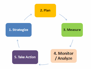
Usually, we set up a complex set of metrics to measure the things that business would have us measure. These could be anything from OH&S incident issues, on-time delivery, average collection period, financial leading and lagging indicators and the performance indicators of where the business is. These are tactical and strategic initiatives.
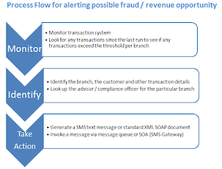
However, Business Intelligence can also be used to take action immediately when something that crosses preset or dynamic thresholds, happens. A simple example might be for a bank, where each branch for each region has a simple threshold for deposits taken at the branch. Let us say this figure is set to $50,000 for Branch 00-11-22. If this threshold is exceeded, a text message will be sent to the financial adviser / risk & compliance officer of the particular branch, notifying them within 60 seconds of the transaction hitting the system.

The BI Tool can monitor the message queues from the bank transaction system (like MQ Series, JMS, etc.) or it can directly interrogate the OLTP datasource, looking for any transactions since the last time the check was done, for any records that meet the selection criteria. For this to work against real-time mission-critical data sources, it is imperative to have fast query performance that will have minuscule effect on the source systems, or if there is a near-real-time data warehouse that can serve as a datasource, the effect is minimized. This is achieved with a pre-written, tuned query, which is predictable.


This simple diagram shows the processes that should be involved for monitoring exceptions, and KPI's for that matter too.


Once one or more records have been identified, a lookup process can occur to see where these records' information needs to be sent (destination).

Once we have the composition of the information to be sent and the destination (an email SMTP server, a SMS Gateway, a SOA enabled application server like SAP , a web destination, etc.), the action designed can be taken.


So from this we can see that BI can be used as a business process monitoring tool as well as a business performance management tool too. The example shown here is simple, but with a near-decent rules engine (or make a call to a SOA enabled service), the net result is that the business is aware of a thing / event "happening" in their business in almost real-time, which is a whole lot better than being told via a report the following week that there was a transaction that could possibly have been a fraud or part of a money laundering operation.

The latency of information in mission-critical environments is inversely proportional to its value, thus for maximum value in these types of scenarios, real-time information (or as close to it as possible) yields maximum value to the business.

16 March 2009

Why does BI fail to deliver?

Why are many BI projects deemed a massive expense the company would not repeat if it had the option? Let's investigate .....

The rest of this article can be found here at http://bit.ly/ct23Ys

03 March 2009

The myth of the Corporate Dashboard

These days it seems dashboards are all the rage. From the Siebel implementations to the legacy systems, to financial, it seems that everyone wants to create the ideal corporate dashboard that will service everyone's goals.

I have a different point of view. You probably would not expect less from me surely :)

The machine operator in the manufacturing assembly line has probably no use for the same KPI's as the financial controller. The Sales executive has a different set of information needs than the Global Manager / VP of Sales. So the answer really lies at the heart of the promise of BI: to provide accurate, actionable information that is relevant to the consumer of the information.

What really needs to happen before just constructing a dashboard, is that the information needs have to be assessed then a relevant set of indicators / measures need to be identified. Once this is done, then optimal visual design can be started.

KPI's
One of my pet peeves, is seeing a requirements document that identifies 100+ KPI's. Let's quickly look at what KPI means. The first letter 'K' means 'Key'. There is no way that 100+ "things" can all be "key" with the same weighting.

Think of a visit to the doctor for a checkup, first your heart is checked, your breathing, your weight, blood pressure and lungs. These are the KPI's. If a doctor picks up that one of these is way out of line from where it ought to be, immediate action can be taken (pills, injection, surgery, rest, etc.). KPI's in business need to be the same, however a business is a very complex organization with many different facets, each managed by a specialist in the relative field.

For finance people, important things to keep track of is current cash burn rate, mean time for collections, percentage of revenue that is late / past due, forecast cashflow, current ratios for assets, debtors, creditors, percentage overrun on budgets / forecasts for month-to-date, year-to-date, etc. This is probably not a full list of all the indicators needed, but you can now
see that these indicators are of very little value to the quality control manager on the plant floor who needs to track things like labour productivity rates, reject rates, inventory control, number of inspections performed and the outliers / exceptions on these figures.

Thus there is a clear need for dashboards per role. There should be a Finance manager dashboard, a Creditors clerk dashboard, a CEO Dashboard, a COO dashboard, a CFO dashboard, a Assembly line manager dashboard, and so the list goes on.

Dashboard Design
Now let's look at the design of dashboards and how easy it is for these to get cluttered. In my opinion, a dashboard should be no more than about 6 - 8 different indicators. Think about your car, you have a speedometer, a tachometer, fuel gauge, temperature gauge, trip meter. These are your key indicators, everything else becomes superfluous. Besides that, do you really get any actionable information from knowing the exact temperature of the oil in the system or the amount of charge generated by the alternator? The key things you can take action on is generally the speed you're traveling at, the amount of fuel in the tank and if you have a GPS navigation system knowing where you're going.

Dashboards should follow a similar design strongly embracing the KISS principle, but I have seen to often how runaway design turns some dashboards from a normal car dashboard into
something you would expect to see in a 747 cockpit, which just becomes intimidating with information overload.

Pictures paint 1,000 words. People have been created as visual beings, so the more one can express on pictures the better.

Pet Peeve: 3D Charts
A caution here is on 3D charts, they create so much more confusion and noise than having things expressed in 2 D. Take a look at some of these 3D charts, some of which look pretty slick and cool. However if the purpose of information is to inform, then these visual representations have just failed the basic premise of what they're trying to do.


Let's discuss this chart and why it has been chosen as a target of criticism. As nice as it is supposed to look, what information are you able to glean from it?
Fault 1: There are 2 Y Axes and it seems they are calibrated the same. Are they? who knows? Take a wild flying guess, they look the same.
Fault 2: What is the green line chart supposed to Show, does it cover the Fifth X Axis value?
Fault 3: Multiple types of charts: Bar charts, area charts and a line chart? Why does each month have a different type of chart when months belong to the same dimension and grain?
Fault 4: What is the purpose of the 3rd dimension?


.


Let's look at this slightly better one to "tear it apart"
Fault 1: the third dimension can hide some of the detail, for instance, the 2nd series of Thursday seems almost hidden from view, so that we cannot get a really good picture.
A much better option here would be to have side by side vertical bar charts for each series, so for each day, we would have 2 bars, a red one (series 1) and a pink one (series2).


What is wrong with this one?
Well, once again, the 3rd dimension causes the first few series to hide the detail of the series that are shown behind.
How can I know for sure the value of Monday at 18:00? I can only assume (ass-u-me, making an ass of you and me) that it follows the trend, but the precision is lost in guesswork. This chart has failed to accurately inform me of the full picture, so in my opinion, is near-useless unless I am happy with making a decision on a partial picture where I get to guess the rest!


So now what could I possibly find objectionable about this beautiful flash chart?

Once again, I can only guess the values for 3rd Quarter for West & South ?

What if the first series (East, the lightest colour) had higher values than the other 2 series? I would not even get a glimpse at the other values.

Bottom line (finally!) folks (my opinion):
Avoid 3D not just in dashboards, but in charts as a whole.
3d seems forgivable when you have a very specific thing that you are trying to show and have good justification for the 3rd dimension.

24 February 2009

Embedded BI: Who gives a click?

The promise of BI in today’s business world sounds exciting, fascinating and shows potential rapid ROI, yet uptake is slow because most organizations do not want yet another application for their end users to log into, yet another application where the data does not match their existing applications’ data and where IT resources are going to be employed to hunt down the discrepancies between systems. So how does BI provide an immediate and tangible return?

In the usual world, where companies have many applications, users often log into their online transactional systems (CRM, ERP, etc.) and then simultaneously open the reporting / BI application. For illustration purposes, let us describe getting a full customer profile report that we are looking at in a CRM / ERP system, where the CRM / ERP system contains the bare essentials. The report might contain the customer’s details, purchase activity, top products, activities and interactions with the company, demographic information, and perhaps some predictive information as to which of our products might interest them based on various factors. When the user wants to find full information on a customer from the reporting system, the user normally highlights the customer number (1 click), copies the customer number (another click or Ctrl-C), then switches to the BI Application (alt-tab, another click), opens the relevant report (another click or series of clicks), then pastes (another click or Ctrl-V) the copied customer id into the report parameter, then clicks the ‘Go’ button (another click). If the report result is then to be saved to a local drive and attached to the CRM / ERP system as an attachment, a whole lot more clicking is going to happen.

The problem with the above scenario is that it is very:
  • time-consuming
  • annoying
  • and the possibility for human error (did not copy the entire customer number, accidentally hit another key while pasting, etc.) increases considerably.

What would save a lot of time, frustration and errors is to have a button from the CRM / ERP system that will do all of that activity for the end user behind the scenes, at machine speeds and show the information as part of an integrated panel in the single application.


The large software application vendors now have readily available embedded BI solutions (Siebel Analytics, SAP BW, Oracle EBS Analytics, etc.), however these are usually tailored to suit the vendor application and are unsuitable for integration into other applications. Furthermore, should you have made any customizations to the ERP / CRM software, those customizations will have to be applied to the BI solution too (usually at great cost). The vendors’ usual approach then is that any other software package that wants to utilize the BI platform should conform to the vendor approach to BI, including warehousing and BI process.

At SeeMoreData, we believe that the ability of BI to enhance the value of an existing application by creating usable analytics and information visualization on the underlying and indirectly related data, whether in real-time or not, will drive the adoption of analytical solutions. This is certainly the case at one of our large banking customers, who have transformed their CRM solution to deliver relevant content that would have taken an eternity (if at all possible) to create using the traditional CRM configuration tool.

What do we mean by this?

Well, instead of getting the users to have 1 more desktop icon, 1 more system to log into, 1 more system to learn to use, we prefer to see our BI engine as a back-end solution that is called by the existing application (Siebel, SAP, IVR Applications, Web apps or whatever) and when the information is served up by SeeMoreData, this is then presented to the user inside their existing application, making it look like it is part of the original calling application. All it requires is a simple call to an internal web server (behind the firewall so data is only visible to whom it should be) with some dynamic components that complete the call, or via a true Service Oriented Architecture (SOA) which then neatly maps into SeeMoreData’s passive calling map technology.

SeeMoreData is flexible enough to send the information requested back to the calling application either as a rich-client fully-interactive applet, or an XML document, or a static file format (Excel, PDF, word, HTML, CSV) to be displayed in the calling application information window / region. In the case of the fully-interactive client, drilldown and drillthrough is possible, even to external systems, using the drilldown key as a lookup / foreign key.

SeeMoreData’s open application integration technology saves many clicks & errors and delivers accurate information where it is needed, and very fast! It is what our customers have come to expect from us.

do you live in Ex-Hell (Excel) ?

This post has moved here:
http://www.seemoredata.com/en/entry.php?3-Do-you-live-in-Ex-Hell